This is a simple but important skill to learn – not just how to get the right size of a background or configure it for the web, but how to design a background that compliments your blog and adds to it. I’ve learned that there’s a lot to making a background that’s pleasing, beautiful, and makes your blog feel bigger.
So, how does someone go about doing that? Well, it’s a good idea to start with a few images – anywhere from two to four. These would be ideally a plain image (with hardly any texture), and then a few textured ones that differ in feel. (So I could pick a flowered texture, and also a grunge one.) Making your textures different in style and design adds interest to the background. (You’ll want to keep your backgrounds anywhere from 1500X850 to 1600X900 – or whatever the size of your screen. The bigger it is, the more assurance you’ll have that everyone with a computer will be able to see the image correctly.) So, now that you’ve chosen your images, open them up in Gimp. (Or Photoshop – both programs work similarly)
1.
Okay. So now we have our three layers out and ready to work with.
2.
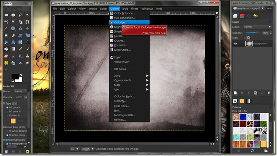
I’m going to colorize my base layer – from a redish gray to something a bit more brown.
3.
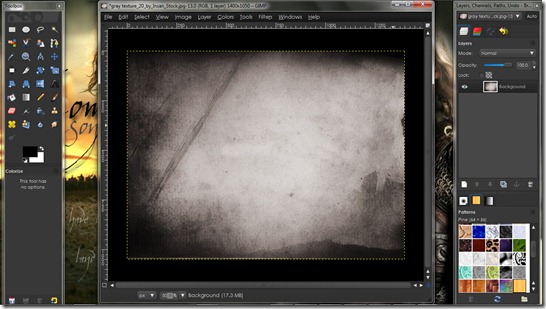
this is what it should look like after going to colorize and choosing my color/saturation/lightness.
4.
Now let’s go to the first textured layer. To make it stand out more, I adjusted the brightness and contrast by going to colors/brightness and contrast and adjusted both to my liking.
5.
Now I’ve gone to edit/copy visible, and then I pasted the checkered layer over our base layer. (edit/paste)
6.
To see both layers, I adjusted the opacity (available in the right hand bar near the top) of the checkered layer to about 24%.
7.
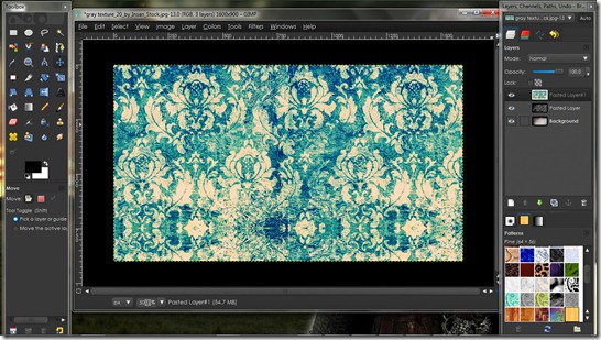
Alright, let’s get to that second texture. I didn’t want a blue background, so I went to colors/colorize and made it a somewhat de-saturated brown.
8.
Here’s what it looks like now with its new color.
9.
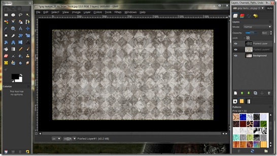
Now let’s copy that layer (edit/copy visible), and paste it over the checker and base layers. Adjust the opacity and move the lacey layer to the middle and we’re done!
This is just an example of all you can do with layers. They’re so much fun, and taking just a few simple layers, putting them together, and adjusting opacity can make all the difference in the world.
Not sure why some people’s backgrounds are so much better than others? Are you having trouble keeping your backgrounds from feeling claustrophobic? I totally understand. Here are some general principals to help.
 1.
1.
keep your backgrounds light. They won’t overtake the design that way – they’ll blend in very well and add to the overall design – not take away from it.
2.
make any images/text/patterns in your background very small – the smaller each item is, the bigger your background will feel. The claustrophobic feeling will be gone!
3.
combine opposite textures. Lace goes well with grunge, and flowers go with diamonds. the more opposite your textures, the more interesting the background will be.
To install your new background on your blog, first upload the image to Imgur. I would recommend this host because they never resize photos, are totally free, and don’t require an account.
Go to Design/Edit HTML, and find the following code:
body {
Right underneath that, paste the following code.
background: #ffffff fixed; background-image: url(YOUR DIRECT LINK HERE);
Get the direct link for your image and paste it right in! You’re good to go! =D And if you have any questions, don’t hesitate to ask.
*The background created in this tutorial is not very light – so it would be much more fitting for a dark blog with a very wide posting area. If I ever use this background, it’ll go with a dramatic theme, and I’ll keep the entire blog very wide so the background doesn’t take over.*


14 comments:
I have just one question - I use GIMP for making the background, and usually, everything's going fine until I try to paste the other layer(s) into the main background. The image that contains the background's contents (like, for example, flowers that I want for the background) seems to get huge when I paste it into the main image. Do you have any idea what I'm doing wrong?
Thank you so much! =)
~Hannah
That would be because your layers are different sizes. They might look to be a certain size, but more likely than not, you're not seeing them full size. To correct that problem, select the layer that's too big, click "layer" and then "scale layer." For a background you'll want to keep all the layers the same size. (I typically keep them at 1600X1000 to be on the safe side) =D You're welcome!!
Oh, and the name by my comment is "photogirl-" not sure why Google switched it back from Hannah. =P Anyway, it's still me! =D
Thank you so much!! You have no idea how much that means to me. :)
{Sorry I got your comments late...}
Thanks again. :)
--Hannah
Quick question, or rather, problem;
When I add it, my entire blog shows up with that backround. How do you get it so that you have a blank space for your posts?
What you can do is find this code -
#content-wrapper {
and either add or modify the "background:" line to this:
background:#ffffff;
That's it! =D
I made the backround line to #ffffff, but when I typed #content-wrapper { into the searchbox, nothing came up! Would you happen to know why that is?
Sorry, I'm being such a pain!
You're not being a pain!! =) It might be the template you're using...are you using Minima or something else? (Blogger has different css with different templates.)
Yes, I have the old Minima template. :)
Okay - see if you can find it by just searching for "content-wrapper." The code will be just under the main wrapper and sidebar codes, all near the top of the page.
Hm...the only content-wrapper I found was near the very bottom of the page. :/
Oh, that's fine. Just as long as the tag is content-wrapper, you're good! So yeah, put the background code in that section and you should be set! Let me know how it goes! =D
Still not working. I tried pasting the background:#ffffff; under the content-wrapper, no avail, and I tried modifying the big piece of code underneath the background: #ffffff fixed; background-image: url(your direct link here);
Apparently, blogger hates me today. :P
Hmmm...weird. Would you mind giving me the link to your blog so I can take a look at the code? =D
Post a Comment