How to Change the Font of Your Post Titles

I’ve seen and heard of so many people who have trouble with this. It seems like all the tutorials are unnecessarily long and hard, and almost every person has some kind of trouble with them. What I want to do is try and create a simple, easy-to-understand tutorial on this, so that even the most inexperienced Blogger can use it easily. =) Alrighty – let’s try this thing.

Download Files

This is the first step. Download all three files and be sure to remember where they are. (right click links and save)

choose your font

I use dafont.com for all my fonts. Be sure to check the permissions on the font you want to use. Download your font. (It will be at least one TTF file) Remember where it is.

Convert TTF to SWF

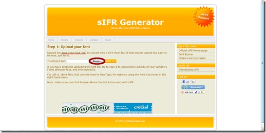
Don’t be freaked out by the title! =D This is no biggie. In order for the titles to work, you have to upload a swf version of your font. To do that, go to sIFR Generator and upload your TTF font file.
sifr-upload
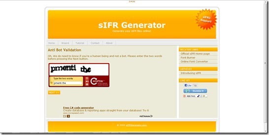
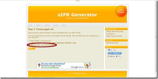
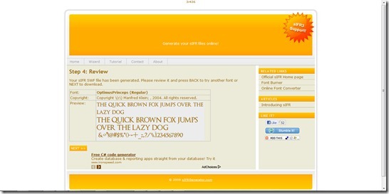
Follow the steps until you have a final, swf product to download:
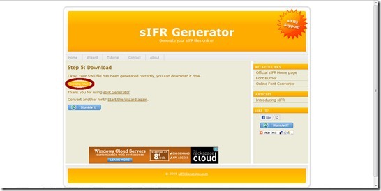
downloadswfreviewwordverificationcharactersetchoosesifrtype
Again, remember where your new swf file is.

Sign into or create new webs.com account

webs.com
You’ll need webs.com to host all your files. You’ll be linking to these files in Blogger. (if creating a new account, follow al the instructions and be sure to choose “HTML only mode” if you are given an option.)

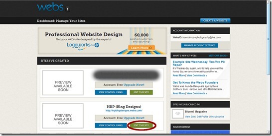
Open correct website for editing

account-home

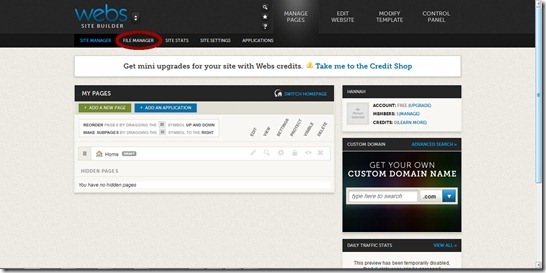
Go to the File Manager

filemanager

Create new folder for your font and upload files

Click “New folder” and name it whatever you want. Now, you need to upload four files (click on “Single File Uploader” – it’s the blue button near the top) – the edit-me.js file, the css.css file, javascript.js file, and your swf file. Do them one at a time until they’re all there.

Edit the code of your edit-me.js file

Click the little pencil to the right of your edit-me.js file.
editcode
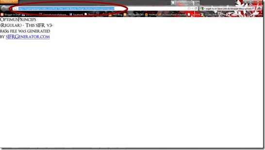
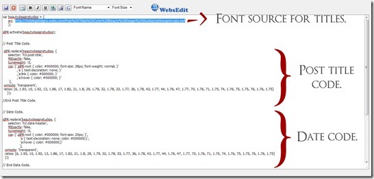
You are now in a text editor. If you want to keep everything simple and easy, then all you have to do is copy the direct link of your swf file, paste it into the edit-me.js file, and save.
copydirectlink-swfeditingcode
Now, this code automatically uses your font for Post Titles, Dates, and Sidebar Headings. (post title code and date code shown in photos above. Sidebar headings code is not shone.) If you don’t want your dates or sidebar headings to be the same font as your post titles, just delete the date and sidebar code.

Editing the CSS of your edit-me.js code

Let’s break the code down a little bit. We’ll work with the code for the post titles. (The CSS styling is exactly the same for all three.)
// Post Title Code.

sIFR.replace(beautydesignstudios, {
selector: 'h3.post-title',
fitExactly: false,
tuneHeight: -5,
css: ['.sIFR-root
{ color: #000000; font-size: 28px; font-weight: normal; }'
,'a { text-decoration: none; }'
,'a:link { color: #000000; }'
,'a:hover { color: #000000; }'

],
wmode: 'transparent',
ratios: [6, 1.93, 10, 1.92, 13, 1.86, 17, 1.82, 21, 1.8, 29, 1.79, 32, 1.78, 33, 1.77, 36, 1.78, 43, 1.77, 44, 1.76, 47, 1.77, 70, 1.76, 71, 1.75, 74, 1.76, 75, 1.75, 76, 1.76, 1.75]
});


//End Post Title Code.


All you need to worry about is the red code. This is the css that styles your post titles. (Very quickly – the blue code declares that we’re dealing with post titles, while the purple code is also css, but not important to us.)


{ color: #000000; font-size: 28px; font-weight: normal; }'


,'a { text-decoration: none; }'


,'a:link { color: #000000; }'


,'a:hover { color: #000000; }'


This code (above) declares what your post titles will look like. The first line is the color, font size, and font weight (decides if the font is normal or bold)


The second and third lines determine what the font looks like when it is a link.


The fourth line determines what the font will look like when you hover over it. Edit these lines as you like them (you can refer to this list of CSS styles to help you out), and do the same for the date and sidebar codes.


Install


Now we’re ready to install all these pieces in Blogger. Copy the code below and paste into your template code (Design/Edit HTML in Blogger) right above the </head> line.


<link href='CSS.CSS FILE DIRECT LINK' media='all' rel='stylesheet' type='text/css'/>


<script src='JAVASCRIPT.JS FILE DIRECT LINK' type='text/javascript'/>


<script src='EDIT-ME.JS FILE DIRECT LINK' type='text/javascript'/>


All you need to do is paste the direct links into this code where stated. Save your template and you’re done!


template-editing


Example: before


example-before


Example: after


example-after


Questions or comments? Don’t hesitate to give me your thoughts! =D


*Credits*


The “Edit-me.js” code is a stripped-down, basic form of the code provided by Kevin and Amanda. I do not claim to have developed this code – it is not my work. I have only edited it slightly.

CSS

*A simple list of CSS styles*

color:#000000;
background: #000000 url(DIRECT LINK);
background-position:top center;
font-family:times new roman, verdana, arial, sans-serif;
letter-spacing:NUMBERem;
font-size:NUMBERpx;
text-align:center;
text-align:right;
text-align:left;
text-align:justify;
width:NUMBERpx;
height:NUMBERpx;
a:link {STYLING, SUCH AS color:#000000;}
a:hover {STYLING}
a:active {STYLING}
body {STYLING}
padding:NUMBERpx;
padding-right/left/top/bottom:NUMBERpx;
margin:NUMBERpx;
margin-right/left/top/bottom:NUMBERpx;

HTML

*A simple list of HTML tags*

<a href=”DIRECT LINK”>LINK NAME</a>
<img src=”DIRECT LINK” align=”CENTER/LEFT/RIGHT”>
<a href=”mailto:EMAIL ADDRESS”>EMAIL</a>
<p align=”CENTER/LEFT/RIGHT”>TEXT</p>
<b>BOLD TEXT</b>
<i>ITALICS</i>
<u>UNDERLINED TEXT</u>
<div style=”CSS STYLING”>

How to Create a Blog Background

This is a simple but important skill to learn – not just how to get the right size of a background or configure it for the web, but how to design a background that compliments your blog and adds to it. I’ve learned that there’s a lot to making a background that’s pleasing, beautiful, and makes your blog feel bigger.

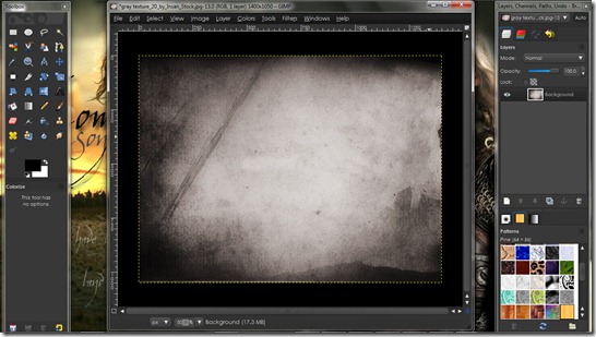
So, how does someone go about doing that? Well, it’s a good idea to start with a few images – anywhere from two to four. These would be ideally a plain image (with hardly any texture), and then a few textured ones that differ in feel. (So I could pick a flowered texture, and also a grunge one.) Making your textures different in style and design adds interest to the background. (You’ll want to keep your backgrounds anywhere from 1500X850 to 1600X900 – or whatever the size of your screen. The bigger it is, the more assurance you’ll have that everyone with a computer will be able to see the image correctly.) So, now that you’ve chosen your images, open them up in Gimp. (Or Photoshop – both programs work similarly)

Fullscreen capture 3102011 100006 PM.bmp


1.

Okay. So now we have our three layers out and ready to work with.


Fullscreen capture 3102011 100356 PM.bmp


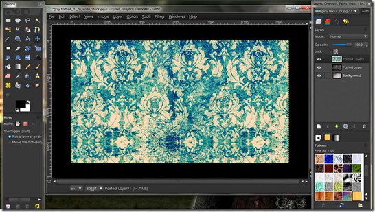
2.

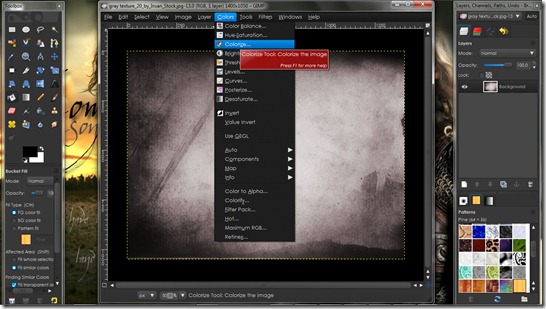
I’m going to colorize my base layer – from a redish gray to something a bit more brown.


Fullscreen capture 3102011 100410 PM.bmp


3.

this is what it should look like after going to colorize and choosing my color/saturation/lightness.


Fullscreen capture 3102011 100502 PM.bmp


4.

Now let’s go to the first textured layer. To make it stand out more, I adjusted the brightness and contrast by going to colors/brightness and contrast and adjusted both to my liking.


Fullscreen capture 3102011 100749 PM.bmp


5.

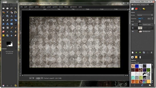
Now I’ve gone to edit/copy visible, and then I pasted the checkered layer over our base layer. (edit/paste)


Fullscreen capture 3102011 100813 PM.bmp


6.

To see both layers, I adjusted the opacity (available in the right hand bar near the top) of the checkered layer to about 24%.


Fullscreen capture 3102011 100836 PM.bmp


7.

Alright, let’s get to that second texture. I didn’t want a blue background, so I went to colors/colorize and made it a somewhat de-saturated brown.


Fullscreen capture 3102011 100904 PM.bmp


8.

Here’s what it looks like now with its new color.


Fullscreen capture 3102011 100929 PM.bmp


9.

Now let’s copy that layer (edit/copy visible), and paste it over the checker and base layers. Adjust the opacity and move the lacey layer to the middle and we’re done!


This is just an example of all you can do with layers. They’re so much fun, and taking just a few simple layers, putting them together, and adjusting opacity can make all the difference in the world.

Not sure why some people’s backgrounds are so much better than others? Are you having trouble keeping your backgrounds from feeling claustrophobic? I totally understand. Here are some general principals to help.

Fullscreen capture 3102011 100929 PM.bmp1.

keep your backgrounds light. They won’t overtake the design that way – they’ll blend in very well and add to the overall design – not take away from it.

2.

make any images/text/patterns in your background very small – the smaller each item is, the bigger your background will feel. The claustrophobic feeling will be gone!

3.

combine opposite textures. Lace goes well with grunge, and flowers go with diamonds. the more opposite your textures, the more interesting the background will be.


To install your new background on your blog, first upload the image to Imgur. I would recommend this host because they never resize photos, are totally free, and don’t require an account.

Go to Design/Edit HTML, and find the following code:

body {

Right underneath that, paste the following code.

background: #ffffff fixed; background-image: url(YOUR DIRECT LINK HERE);

Get the direct link for your image and paste it right in! You’re good to go! =D And if you have any questions, don’t hesitate to ask.

*The background created in this tutorial is not very light – so it would be much more fitting for a dark blog with a very wide posting area. If I ever use this background, it’ll go with a dramatic theme, and I’ll keep the entire blog very wide so the background doesn’t take over.*

How to Create a Drop-Down/Accordion/Toggle Menu

Finally – the long-awaited tutorial on menus – called drop-down, accordion, and toggle…whichever you like Fullscreen capture 4192011 124206 PM.bmpbest. ;) This is what the basic menu will look like (you can change colors, size, and content. This is the one I have on this blog.) Here we go!

step one {analyze}

Before you start doing any copying or writing for the menu, we need to break the code down. There are three parts to make this work.

  • CSS (To make the buttons look pretty)
  • JavaScript (To make it actually drop down)
  • HTML (To build the actual menu)

Let’s look at the basic code. (Keep in mind the color code.)

<style type="text/css">

#wrapper {
    width: 200px;
    margin-left: auto;
    margin-right: auto;
    }
 
.accordionButton {   
    width: 200px;
    float: none;
    background: #C0C0C0;
    cursor: pointer;
    color:#000000;
    text-align:center;
    padding:0px;
    margin-bottom:2px;
    }
 
.accordionContent {   
    width: 200px;
    float: none;
    background: #ffffff;
    display: none;
    }

</style>


<!doctype html public "-//W3C//DTD XHTML 1.0 Transitional//EN" "http://www.w3.org/TR/xhtml1/DTD/xhtml1-transitional.dtd">


<script type="text/javascript" src="http://ajax.googleapis.com/ajax/libs/jquery/1.3.2/jquery.min.js"> </script>
<script type="text/javascript" src="
http://hrpblogdesigns.webs.com/Accordion%20Menu/javascript.js"> </script>


    <div id="wrapper">
        <div class="accordionButton">BUTTON NUMBER ONE NAME</div>
        <div class="accordionContent"><p align="center"> YOUR CONTENT HERE</p></div>

<div class="accordionButton">BUTTON NUMBER TWO NAME</div>
        <div class="accordionContent"><p align="center">YOUR CONTENT HERE</p></div>

        <div class="accordionButton">BUTTON NUMBER THREE NAME</div>
        <div class="accordionContent"><p align="center">YOUR CONTENT HERE</p></div>

</div>       

</!doctype>

Okay! That doesn’t look to bad, does it? Not at all. Now, copy and paste it all into a widget box on your blog.

  Let’s start with the styling – the CSS. Here are some principals.

#wrapper {                                                This addresses the buttons and their content.
    width: 200px;                        Establishes the width of your buttons and their content.
    margin-left: auto;
    margin-right: auto;
    }
 
.accordionButton {   
    width: 200px;
    float: none;
    background: #C0C0C0;                                                Establishes background color.
    cursor: pointer;               Makes the cursor into a little hand when you mouse over.
    color:#000000;                      The color of the text on your buttons. (But not content)
    text-align:center;          Aligns everything in the center. It can also be left or right.
    padding:0px;
    margin-bottom:2px;         Creates a tiny bit of white space between each button.
    }
 
.accordionContent {   
    width: 200px;
    float: none;
    background: #ffffff;                                                 Background color of your content.
    display: none;
    }

Make any and all adjustments to that code. Now that it looks pretty, let’s add the HTML structure. (We’ll ignore the JavaScript – what I’ve done is linked to the source…I host it…and there’s no need to edit it.)

<div id="wrapper">
        <div class="accordionButton">BUTTON NUMBER ONE NAME</div>
        <div class="accordionContent"><p align="center"> YOUR CONTENT HERE></div>

<div class="accordionButton">BUTTON NUMBER TWO NAME</div>
        <div class="accordionContent"><p align="center">YOUR CONTENT HEREp></div>

        <div class="accordionButton">BUTTON NUMBER THREE NAME</div>
        <div class="accordionContent"><p align="center">YOUR CONTENT HERE></div>

</div>       

</!doctype>

This is very self-explanatory. Make sure to only erase the bold words, though – don’t touch anything else or it won’t work. Here are some principals to keep in mind when writing the code - 

Adding links

<a href=”YOUR LINK”>LINK NAME</a>

adding photos

<img src=”DIRECT LINK TO PHOTO” alt="ALTERNATE TEXT, SUCH AS BIO PHOTO" />

Embellishments

<b>TEXT YOU WANT BOLDED</b>

<i>TEXT YOU WANT IN ITALICS</i>

<font color=’#000000’>TEXT YOU WANT COLORED</FONT>

Now that you’ve styled your menu, written your content, and make it pretty with photos, links, and colors, you’re all done! =D Now, unless you’re very experienced in writing code, you’ll probably make some mistakes – but don’t get frustrated! HTML and CSS are picky things to deal with. If you forget even one character or symbol, it won’t work. So if something is going wrong and you just can’t figure out what it is, let me know and I’ll help you out. ;)

Do realize that while this tutorial will work on most browsers, it won’t work on all. When I took the poll here a few weeks ago, two people out of twenty-eight couldn’t use the menu. So a small percentage of people won’t be able to use it…but most will. It’s okay – it’s part of life with different browsers. ;)

Did you use this tutorial to create your own menu?? I want to see it!! Leave a comment with the link to your blog and I’ll check it out! And congratulations on conquering the scary mountain of drop down menus. ;)

How to Create a Rotating Header

This tutorial is specifically for Allie and Emily Grace. ;) I’m glad they asked about this – because it’s something that everyone always wants to know and should know.
Now, there are two ways to do this. One way is to use only HTML, and the other is to us JavaScript. Using just HTML means that it’ll work in any browser, but JavaScript is a bit more sophisticated looking. I’ll be giving you the JavaScript method.

Step one {creation}

Create the images will you use for the header. For example, these are the three I created for Allie’s blog.
allie-rotating-1allie-rotating-2allie-rotating-3
Create anything you want, just make sure that the images are as wide as your blog is. Don’t know how wide it actually is? Check by finding the following code -
#outer-wrapper {
width:
The number just after “width:” is how wide your blog is. Make sure that every image is exactly the same width and height.

step two {uploading}

Upload all images to a host. I use Photobucket. Make sure you can find the direct links to your images.

step three {time to cheat}

Okay – it’s time to cheat. I’ve written programs with JavaScript before, but let me tell you, it ain’t easy. So in this step we’ll use a special generator to get the actual code. http://www.htmlbasix.com/banner.shtml
Now, let me warn you – this site is rife with adds. But it works. Their instructions are very simple and easy to understand – make sure you read the whole thing and put in everything asked for. And don’t forget to put in exactly what the width and height is for the images…remember, they should be the same for every image.

step three {installation}

After you’ve copied the code that the generator will give you, log into Blogger, and go to Design/Page Elements. Click “Add a Gadget” at the header, choose html/javascript, paste your code in, and hit save! It’s as simple as that.
Once again, if you have any questions don’t hesitate to ask! =D

How to Move Your Sidebar

Marieanne wanted to know how to move her sidebar to the left of her posting area – and I thought it was a great question! This is very simple and easy to do.
First off, locate this code.
#main-wrapper {
width: 820px;
-webkit-border-radius: 20px;
-moz-border-radius: 20px;
border-radius: 20px;
padding-left: 20px;
padding-right: 20px;
background: #ffffff;
float: left;
word-wrap: break-word; /* fix for long text breaking sidebar float in IE */
overflow: hidden;     /* fix for long non-text content breaking IE sidebar float */
}

#sidebar-wrapper {
width: 200px;
padding-right: 15px;
padding-left: 15px;
padding-top: 10px;
float: right;
word-wrap: break-word; /* fix for long text breaking sidebar float in IE */
overflow: hidden;      /* fix for long non-text content breaking IE sidebar float */
}
Yours might look a bit different – that’s okay. This is the code for the sidebar and posting area. Right now the sidebar is on the right, and we’re going to move it to the left. All you have to do is find “float:right;” under “#sidebar-wrapper” and change the “right” to “left.”
Now, the posting area should be correctly aligned on the right, but double check. Your finished code should look like this -
#main-wrapper {
width: 820px;
-webkit-border-radius: 20px;
-moz-border-radius: 20px;
border-radius: 20px;
padding-left: 20px;
padding-right: 20px;
background: #ffffff;
float: right;
word-wrap: break-word; /* fix for long text breaking sidebar float in IE */
overflow: hidden;     /* fix for long non-text content breaking IE sidebar float */
}

#sidebar-wrapper {
width: 200px;
padding-right: 15px;
padding-left: 15px;
padding-top: 10px;
float: left;
word-wrap: break-word; /* fix for long text breaking sidebar float in IE */
overflow: hidden;      /* fix for long non-text content breaking IE sidebar float */
}
That’s it! Very simple and easy to do! If you have any questions or problems, though, don’t hesitate to comment and let me know.
*The drop-down menu tutorial is coming soon!! Be looking for it in the next week or so!*

How to Widen Your Post Area

Bella Skye requested a tutorial on widening post areas - so here's a quick how-to. =) This is an excellent question, and very easy to do.


You first need to decide how much wider you want your posting area to be. I generally keep it at about 700 to 800 pixels wide...so remember how wide you're going to have yours.

Go into "Edit HTML" and find this line-

#outer-wrapper {
width: 1000px;

(You can find it by hitting ctrl + f)
This is the width of your blog. Your width might be different from mine, but everything will be the same except for the number. Write down the number you see there.

Now scroll down just a little bit to

#main-wrapper {
width: 720px;

This is the section that decides how wide your posting area will be. Again, our numbers might be different. Write down the number you see in your template. Now it's time to do some math! ;)

Subtract the width of your main wrapper from the width that you want it to be.
(i.e. if I wanted a new area of 800px, I would do 800px-720px=80px)

The number you get (80px in my case) is how many pixels you need to add to your outer wrapper.

So go back and add the number you just got (80px for me) to the width of your outer wrapper. My code now looks like this -


#outer-wrapper {
width: 1080px;

The last step is the easiest. Go back to your main wrapper and type in the width you want your area to be. (So I would type in 800px in place of 720px)

That's it! Now, to summarize - what you're doing is increasing the total width of your blog so that you can widen your post area. With just a little math you can make it just perfect!

If you have any questions or were totally confused by this tutorial, please don't hesitate to comment! =) I would love to help you out!